Creating a peaceful and relaxing environment at home often starts with the colors on your walls and in your décor. Calm colors can influence your mood, reduce stress, and help you feel more comfortable and at ease. But with so many shades to choose from, picking the right calming colors might feel overwhelming. In this post, we’ll share practical tips to help you select tranquil colors that harmonize beautifully in your living space.
Why Choose Calm Colors for Your Home?
Calm colors, often soft and muted, evoke feelings of serenity and balance. They can help reduce visual clutter and create a soothing atmosphere, making your home a sanctuary from the busy world outside. These colors work especially well in bedrooms, living rooms, and any space where you want to relax.
Understanding Calming Color Families
Before diving into tips, it’s helpful to know which color families tend to be calming:
– Blues: Often associated with the sky and water, blue tones are naturally soothing and promote relaxation.
– Greens: Reminiscent of nature, green has a balancing and refreshing effect.
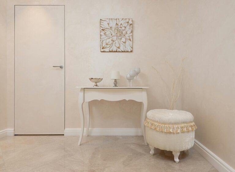
– Neutrals: Soft greys, beige, warm whites, and taupe provide a peaceful, adaptable backdrop.
– Soft Pastels: Gentle shades of lavender, blush pink, or pale yellow can also create calmness without overwhelming.
Tips for Choosing Calm Colors
1. Consider the Mood You Want to Create
Different calm colors can subtly affect your mood. For example, blue can feel cool and refreshing, while soft green can be more nurturing and grounding. Think about the mood you want for each room:
– Bedroom: Opt for soft blues or muted greens to encourage restful sleep.
– Living Room: Warm neutrals or pastel shades create a welcoming, relaxing space.
– Bathroom: Crisp light blues or seafoam green evoke cleanliness and calm.
2. Test Colors in Natural and Artificial Light
Lighting plays a big role in how colors look. Paint samples can look very different in varying light conditions:
– Observe your paint samples at different times of day.
– Check how natural light from windows affects the hue.
– See how your chosen artificial lighting (warm or cool bulbs) changes the color’s appearance.
Testing colors in your own home helps ensure the calm tones feel just right throughout the day.
3. Use Color Samples and Paint Swatches
Get paint swatches or sample jars from your local store. Paint a small area on your wall to see how the color interacts with your furnishings and décor. Live with the samples for a few days to see if the colors continue to feel calming.
4. Balance Cool and Warm Undertones
Calm colors can have cool or warm undertones. To maintain a peaceful vibe:
– Pair cool-toned blues or greens with warm neutral accents like wood or beige.
– Use warm pastel shades with cooler hues in furnishings or accessories.
– Avoid mixing too many contrasting undertones, which can create visual tension.
5. Incorporate Neutral Colors for Versatility
Neutral colors act as an excellent foundation to balance more colorful calm tones. Soft whites, creams, and light grays allow calm accent colors to stand out without overwhelming the space. They also add a timeless, clean feel.
6. Think About Texture and Finish
Color alone doesn’t create calmness. The texture and finish play a part in the overall mood:
– Matte or eggshell finishes soften walls and reduce glare.
– Textured fabrics, rugs, and cushions add warmth and comfort.
– Natural materials like wood, linen, or cotton paired with calm colors boost the tranquil feel.
7. Use Color Psychology as a Guide
While personal preference matters most, understanding basic color psychology can help:
– Blue lowers heart rate and creates calm.
– Green reduces anxiety and symbolizes renewal.
– Soft yellow can elevate mood without being overwhelming.
– Lavender helps reduce stress and promote calmness.
Choose shades that align with how you want to feel in each room.
8. Limit Bright or Bold Accents
In a calm color scheme, keep bold, bright colors minimal. Use them sparingly in pillows, artwork, or décor pieces to add interest without disturbing the peaceful vibe.
9. Coordinate with Existing Furniture and Décor
Before finalizing your color choice, consider the colors and style of your current furniture and décor. A calm color palette should complement rather than clash with existing elements.
10. Trust Your Instincts
Finally, trust your gut! Calm colors should feel inviting and relaxing to you personally. Don’t hesitate to choose colors that make you smile and feel calm whenever you come home.
Popular Calm Color Palettes to Explore
If you want to start with some proven palettes, here are a few popular calm combinations:
– Seafoam green, soft white, and light oak wood
– Powder blue, warm gray, and cream accents
– Lavender, pale pink, and light beige
– Muted sage green, off-white, and natural textures
– Light grayish blue, taupe, and soft gold details
Final Thoughts
Choosing calm colors for your home is an enjoyable way to create a tranquil and inviting space. By considering the mood, lighting, undertones, and how colors work together, you’ll build a balanced environment that feels peaceful every day. Start small, experiment with samples, and let your home become the relaxing refuge you deserve.
Happy decorating!